Cross-Platform Runtime Model
Hosanna separates presentation intent from the concrete host platform. Product
code should usually ask what kind of experience it is rendering (tv, web,
phone, tablet, or watch) and use capability checks for platform services,
rather than branching directly on a device name. Car targets currently keep the
phone expression and expose their semantic surface through carUI capabilities.
Runtime Vocabulary
expression: presentation intent:tv,web,phone,tablet, orwatch.platformId: concrete host target such asroku,web,web-pwa,tizen, orwebos,apple-native-ios,apple-native-carplay,apple-native-watch,android-native,android-native-auto, orandroid-native-watch.runtime: renderer family:roku-scenegraph,web-dom,apple-native, orandroid-native.os: host OS family such asroku,web,tizen,webos,ios,android,tvos,androidtv,watchos, orwearos.formFactor: runtime UX class:tv,desktop,phone,tablet, orwatch. HST target inventory additionally usescarto classify the phone-hosted CarPlay and Android Auto destinations.orientation: current design-surface orientation. It does not select a platform or config by itself.
This model lets TV, native mobile, car-template, and watch targets stay on their appropriate native renderers while sharing app-level intent. Legacy Capacitor/WebView shells are outside the current capability-ID contract; native Apple and Android launchers are the default path for current development.
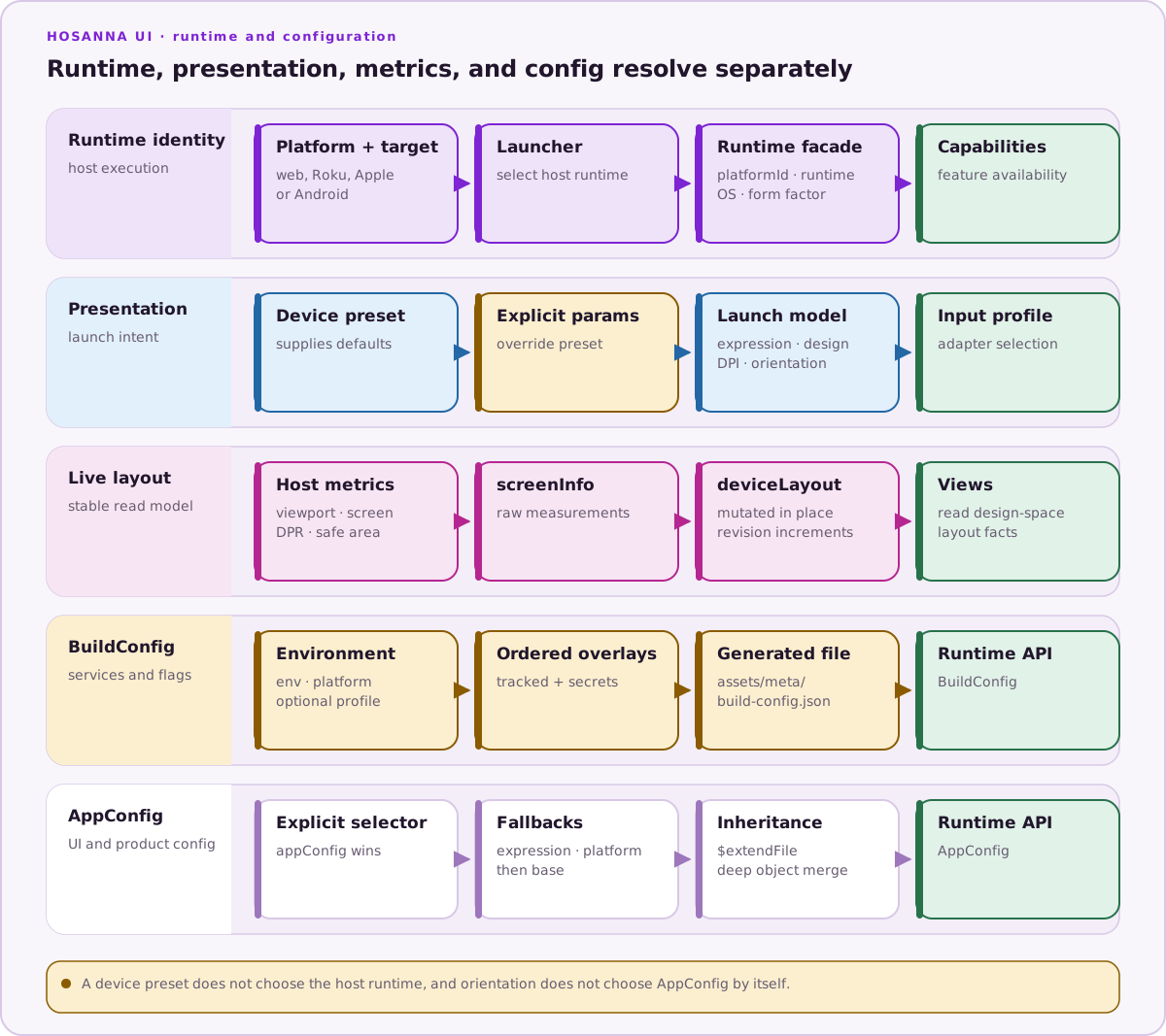
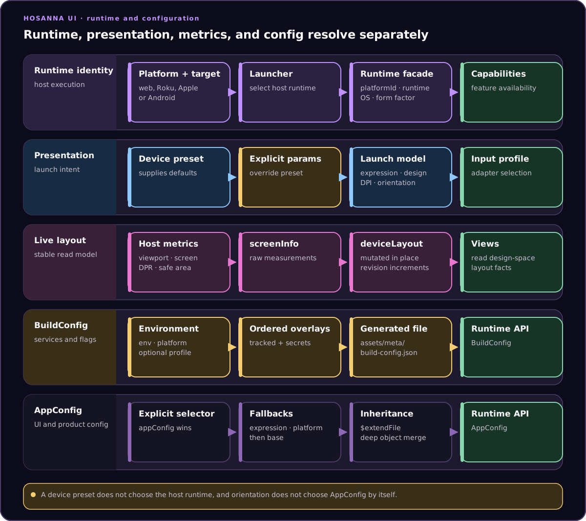
Runtime selection, presentation defaults, live measurements, BuildConfig, and AppConfig have related inputs but remain distinct resolution paths.
Config Variants
The base config remains assets/meta/app.config.json. Variants use app.config.<name>.json, for example:
app.config.phone.jsonapp.config.tablet.jsonapp.config.web.jsonapp.config.roku.jsonapp.config.mobile.jsonapp.config.watch.json
AppConfig candidate resolution is expression-first:
- Explicit
appConfiglaunch/query override. - Expression variant such as
app.config.phone.json. - Exact HST platform variant during tooling/build resolution, such as
app.config.apple-watch.json. - Host-family variant such as
app.config.ios.jsonorapp.config.android.json, when applicable. - Base
app.config.json.
The runtime loader receives the host family, while Hosanna Tools also knows the
exact HST target. Consequently CarPlay and Android Auto still use the phone
expression, but tooling can select an explicit target variant before falling
back to ios or android.
Device presets expand into expressions. For example, ?device=iphone-15 selects expression=phone, and ?device=galaxy-tab-s9 selects expression=tablet; the device name does not directly select a config file.
device=tizen and device=webos select TV dimensions, expression, OS, and
adapter profile for an already-compiled desktop target. Initializer and factory
aliases are resolved at compile time, so a Browser bundle does not become a
Tizen or webOS bundle because its query string changed.
Variants can inherit another file with root-level $extendFile:
{
  "$extendFile": "./app.config.json",
  "appSettings": {
    "configVariant": "phone"
  }
}
Objects merge deeply with child values winning. Arrays and scalar values replace the parent value. $extends keeps its existing in-file style-reference meaning and is separate from $extendFile.
Device Metrics
Use deviceLayout for cross-platform layout decisions in views. Avoid scattering direct window, user-agent, or platform checks through view code.
Important fields include:
expression: active app/layout expression.deviceLayoutOrientation:portraitorlandscapedesign orientation.deviceDpi: physical pixel width for the active design surface.devicePreset: optional preset name that supplied the metrics.resolutionInfo: resource-resolution suffix, scale, width, and height.screenInfo: raw host viewport, screen, DPR, and safe-area values.layoutInfo: the shared view-facing object also available as injecteddeviceLayout.
screenInfo remains the raw platform measurement contract. It contains only viewport size, host screen size, device pixel ratio, and safe-area insets. It should not accumulate derived layout flags or app-neutral content helpers.
deviceLayout / hosannaDevice.layoutInfo is the fast read model for views:
mode,expression,orientation, and booleans such asisTv,isPhone,isTablet,isPortrait, andisLandscape.designWidth/designHeightfor the active Hosanna design surface.viewportWidth/viewportHeightandhostScreenWidth/hostScreenHeight.- Safe-area scalar fields and safe-area-aware padding/content bounds.
revision, incremented when exposed layout fields change.
The object identity is stable. Platform initializers register the deviceLayout IoC service explicitly, and HosannaDevice injects that same object as layoutInfo. Runtime metric changes mutate fields in place, so existing injected references stay current.
On Web, screenInfo comes from browser metrics and CSS safe-area env values.
Native targets supply platform-native screen, cutout, and safe-area values
through the same facade.
Web Launch Parameters
The web entry point accepts launch parameters for expression, device presets, design size, DPI, orientation, and input adapters:
http://localhost:5170/?device=iphone-15&orientation=portrait&adapters=touch,keyboard
Common parameters:
| Parameter | Purpose |
|---|---|
| `expression=tv | web |
device=<preset> | Expands to a known device profile, including expression, design size, DPI, adapter profile, and orientation defaults. |
| `orientation=portrait | landscape` |
designWidth / designHeight | Logical design surface size. |
displayWidth / displayHeight | Aliases for designWidth / designHeight. |
dpi | Physical output width. The renderer computes dpiScale = dpi / designWidth. |
adapters=touch,keyboard,mouse,roku | Limits active input adapters. |
showRemoteOverlay=true | Shows the on-screen remote overlay. Use tiny or mini for compact overlays. |
For existing TV-authored screens, keep the TV design surface and change the expression/output:
http://localhost:5170/?expression=phone&orientation=portrait&designWidth=1920&designHeight=1080&dpi=1179&adapters=touch,keyboard
For mobile-authored screens, use phone-sized logical values:
http://localhost:5170/?expression=phone&orientation=portrait&designWidth=393&designHeight=852&dpi=1179&adapters=touch,keyboard
See Browser Expression, DPI, and Touch Input for input adapter and pointer-normalization details.
Orientation
Orientation changes go through the orientation controller instead of direct view mutation. The controller:
- Normalizes the target orientation.
- Checks whether the platform adapter supports it.
- Asks the app whether the change is allowed.
- Calls app and visible-view
onWillChangeOrientationhooks. - Updates device metrics and mutates the shared
deviceLayoutobject. - Calls app and visible-view
onDidChangeOrientationhooks. - Dispatches
HosannaDeviceMetricsDidChange. - Invalidates the root and visible navigation-controller view.
Views can override:
canChangeOrientation(event): boolean
onWillChangeOrientation(event): void
onDidChangeOrientation(event): void
Hosanna also dispatches HosannaOrientationWillChange and HosannaOrientationDidChange through the notification center. Use those notifications when a service or view needs to observe orientation without owning the visible root.
Non-orientation metric changes, such as web viewport resize or native safe-area changes, use the same metrics invalidation path. They refresh deviceLayout, dispatch HosannaDeviceMetricsDidChange, and invalidate the visible root even when orientation did not change.
Capabilities
Use platform capabilities for feature decisions. Current capability groups include:
video: HTML element playback, WebKit AirPlay, Chromecast Web Sender, native cast bridge, native media session.input: touch, mouse, keyboard, and remote availability.orientation: portrait lock and landscape-video support.sharingandnativeSheets: native share/action-sheet availability.notifications: permission, scheduling, registration, receipt, and action support.storage: offline assets, filesystem, registry, and transfer support.networkandappLifecycle: status/events and native launch URL support.purchases,casting, andauth: target service availability.webViewandscroll: embedded Web content and native scroll-host support.layout: safe-area insets.carUI: semantic list templates, navigation, revisions, and session lifecycle.watchUI: semantic lists, navigation, revisions, lifecycle, reachability, ambient state, and rotary input where supported.
For platform-only APIs, expose the behavior through a platform capability or a small adapter boundary first. Avoid direct platformId or os branching in product views unless the branch sits behind that adapter.
Browser, Samsung Tizen, and LG webOS use PlatformRuntime.WebDom. Browser keeps
the compatible Web/WebPwa runtime IDs; packaged TVs report their vendor ID and
OS. Current iOS/tvOS and Android targets use native renderer families. App code
should still prefer expression and capability checks.
Cross-Platform Color Values
Color strings are normalized to #RRGGBBAA across renderers. #RRGGBB receives FF alpha, and 0xRRGGBB / 0xRRGGBBAA are accepted. Do not treat a leading FF or 00 as ARGB; alpha is last, so #FFFFFF00 is transparent white.